

Communicating with Data
How responsibility changes what data needs to do


When I first began using data as a way to communicate and support decisions, I was very close to the work. We were making choices about where and how to invest in our website, which drove leads, supported sales with existing clients, and delivered our products.
My job was the analysis: traffic, conversions, leads, performance. My audience was small and familiar: my team, my manager. If people had questions, we went deeper.
As my responsibilities expanded, I wasn’t just close to the work anymore - I was coordinating work.
There was still a strong foundation of data, and our team still worked through the details. But now my role included bringing that work up to other managers so we could prioritize and allocate resources. These were people accountable for timelines, budgets, and risk across areas they didn’t personally touch every day.
This is where something changed. People skimmed instead of reading. The “right” level of detail varied widely. Questions shifted from ‘how were these numbers calculated?’ to ‘so what?’ or ‘should I be worried?’ Accuracy alone no longer guaranteed understanding or support.
Eventually, I found myself supporting decisions even further from the work: helping set direction. I was presenting to senior leaders who weren’t trying to understand the analysis in detail. They were trying to make decisions under uncertainty.
The question was no longer ‘Is this analysis solid?’. It was ‘What path does this data support, and what happens if we’re wrong?’
They were weighing trade-offs. Assessing risk. Deciding where to commit or pull back resources.
I didn’t move smoothly through these shifts. For a while, I kept presenting data the way I always had, assuming the work would speak for itself. Sometimes it did. More often, it didn’t. The result wasn’t just confusion - it was delay. Work stalled because the case for what we needed wasn’t persuasive.
It took a few misfires to realize that accuracy and detail alone weren’t enough. I needed to rethink how I was presenting information, not just what I was presenting.
What changed wasn’t the data.
What changed was the decisions being made with the data, and my responsibility for how the information shaped those decisions.
A New Part of the Job: Translation
What I eventually realized is that my audience’s needs had to drive how I expressed the data: from which charts or analyses I led with, to how I talked about implications and uncertainty.
I needed to take the data my team and I understood intimately and present it in a way that helped others make decisions and secure the people, funding, and direction the work needed to move forward.
That was a shift: from delivering analysis to translating it for decision-making.
Earlier in my work, providing all the evidence was essential for credibility. And that rigor didn’t go away; I still needed to have the detail ready if someone wanted to go there. But now, the goal wasn’t to show everything I knew. It was to support a decision and make a clear case for the path I believed we should take.
Translation was about taking work my team and I understood deeply and making it usable in the context of a real decision.
Translation is choosing what to lead with, what to summarize, and what to hold in reserve, so the data support the decision at hand and the work has a chance to move forward.
Same data. Different questions. Different decisions.
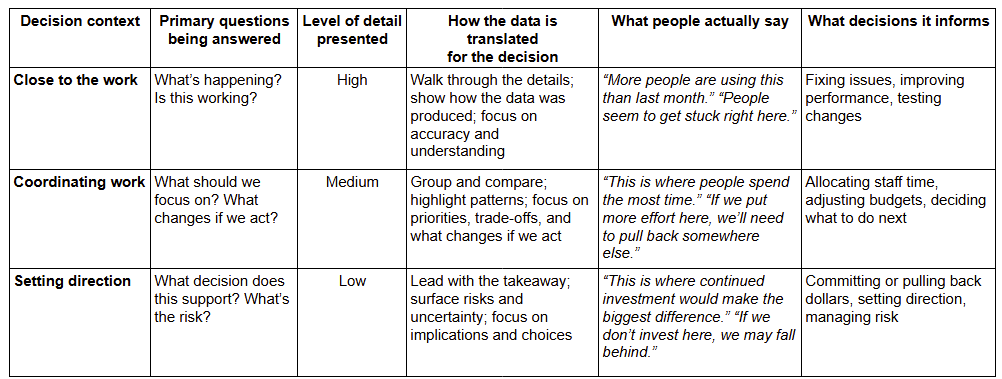
To make this real, let’s look at a familiar example and see how the way we talk about the data changes as decision responsibility changes.
I’m using a website here, but the same pattern shows up anywhere people interact with your work, whether that’s product pages, public portals, library databases, donation inflows or enrollment forms. Wherever people engage, the data describing that engagement becomes an input to decisions about where to spend time, money, and attention.
When you’re close to the work, website data helps answer: What’s happening? Is this working? Traffic patterns, drop-offs, and usage help diagnose issues and test improvements. The dollar impact is indirect; your work supports better execution.
When you’re coordinating work, the same data helps answer: What should we focus on? Which areas deserve more attention? Where should staff time, design effort, or marketing support go, and where should it be pulled back? At this level, the data starts to support recommendations and trade-offs that map directly to budgets and capacity.
When you’re setting direction, the question sharpens further: Is this where we want to place our bets? Leaders are deciding whether the signals are strong enough to justify investment, what the risk is if they’re wrong, and what they’re choosing not to fund as a result.

The data hasn’t changed. The decision and the consequences have. That means the way you frame the data has to change too.
How the Same Data Gets Used Differently
Here’s how that shift shows up in practice: what you emphasize, what you summarize, and what you keep in reserve.
Where Translation Starts: Your Message
When data doesn’t have the effect you expect, it’s rarely because people are anti-data. People don’t resist data. They resist irrelevance.
To avoid this situation, consider these questions before you start polishing slides or pulling screenshots:
Who is this for, and what kind of decision are they responsible for?
Are they close to the work, coordinating it, or setting direction?What decision is being made - and what outcome am I trying to support?
People, budget, direction, or permission to proceed?What does this audience already know, and what don’t they?
What context can you skip, and what must be explicit?What would be easy to misread without framing?
Where could someone draw the wrong conclusion?
Once you’re clear on those answers, then build the charts.
A few guardrails help keep the focus where it belongs:
Don’t lead with detail when the decision is directional.
Keep depth available, but don’t make it the entry point.Don’t hide uncertainty to make the case cleaner.
Decision-makers need to understand risk, not be shielded from it.Don’t present data as neutral when you have a recommendation.
Translation often means stating your point of view — and standing behind it.
And resist the urge to re-explain the chart, add more slides, or defend methodology when that isn’t what’s actually being questioned.
Done well, this preparation keeps you from drowning people in detail or oversimplifying and losing trust - and it lets you lead the conversation instead of waiting to be asked.

Data Translation is a Leadership Skill
As your responsibility grows, the work stops being just about producing accurate analysis. It becomes about helping good decisions happen: advocating for the resources, direction, and support the work actually needs, while making the trade-offs visible and the risks explicit.
You’ll encounter these shifts more than once. Roles and contexts change. Decisions move further from the hands-on analysis. Each time, the data may stay the same, but how you position it has to adapt.
That ability to adapt - to translate with judgment - is using data as a leadership tool.