
The Excel Skills That Make Your Data More Useful
Explore, investigate, and act on your data with a handful of fundamental Excel skills.


Someone sends you a spreadsheet with a few hundred rows of data.
You know enough to have questions: Are there duplicates? Why are some values so high? Are we missing information? How do I compare sales across different regions or customer groups?
But knowing what you want to investigate and knowing how to get the spreadsheet to answer you are two different things.
Data literacy means tool literacy, too.
Knowing what a number actually measures, when to question it, or what else you should look for are all essential data literacy skills. But those instincts become much more useful when you also have enough command of the tools in front of you to act on them.
The good news is that you don’t need to memorize a bunch of formulas or become a programmer.
With a few relatively simple Excel skills, a spreadsheet becomes something you can interrogate, dramatically changing what you are able to do with the data in front of you. You can explore it yourself, pursue the questions that occur to you, and rely less on someone else to run every report or answer every follow-up question.
One note: we’re focusing on Excel here because it’s pervasive. But these same skills apply in Google Sheets, often with nearly identical mechanics and even the same menu options.
The threshold for becoming substantially more capable with a spreadsheet is lower than you might think. Excel has immense capabilities, but you only need to scratch the surface to cover the fundamentals of working with your data.
Sometimes the biggest barrier is simply knowing what the heck a software program calls the thing you want to do. So let’s start with what you’re trying to accomplish, and then translate that into Excel’s language for how to do it.
7 Excel Skills to Analyze Your Data
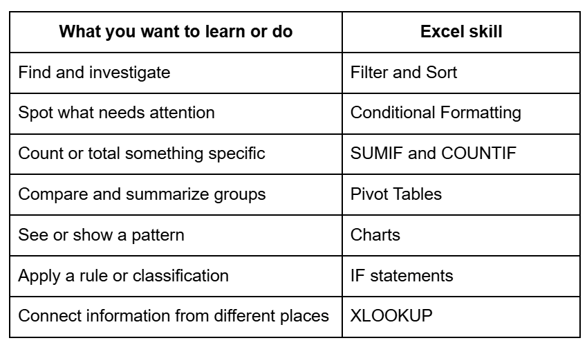
This isn’t an exhaustive list of everything worth knowing in Excel. It’s a practical starting map: a small set of skills that significantly expands what you can do with everyday data.
We’ll walk through the first two skills in more detail, then give you enough to start exploring the rest. Our goal isn’t to teach you everything Excel can do. It’s to show how quickly a few fundamental skills can make your data more useful.
Start here! Two skills with immediate payoff
Let’s start with the first two. They have a low barrier to entry: neither requires writing formulas, and both produce an immediate, visible change in what you can learn from a spreadsheet.
We’ll be using a generated sample dataset. You can download it here and follow along.
Imagine this report is a list of customer accounts from a company that sells products to businesses across the United States. It includes 100 customers, along with their industry, region, account status, recent purchasing activity, and sales.
We’ll use just two Excel skills - filtering and sorting, and conditional formatting - to turn those 100 rows into something much easier to explore.
Skill 1: Filter & Sort
Use it to: Find and investigate.
Instead of scrolling and scanning rows and trying to keep track of what you’re seeing, filtering and sorting lets you narrow the data to what matters for the question you’re asking.
For example:
Which customers have the highest year-to-date (YTD) sales?
Which accounts are currently marked At Risk?
Which Southwest customers have the highest YTD sales?
Which industries are represented among our Enterprise customers?
Let’s try one.
First move: Turn the data into an “Excel Table”
Yes, the sample spreadsheet is structurally a table: it has rows and columns, and the data are cleanly arranged in fields. This isn’t the same as an Excel Table. An Excel Table tells Excel that this block of cells belongs together as one dataset. That unlocks some handy features that make the data easier to work with, and harder to accidentally break.
Watch the video (YouTube)
Before you do anything else, convert the raw data to an Excel Table:
Click anywhere in the data.
Hold down Ctrl (Windows) or Command ⌘ (Mac) while you tap the “T” key.
The entire range of your data should be specified in the popup box.
Typically Excel can identify whether your data has a header row specifying the fields; if not, make sure the box for “My table has headers” is checked.
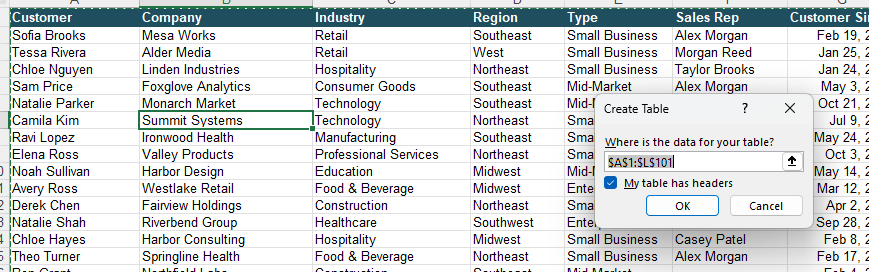
Once you format your data list as an Excel Table:
Filters become available automatically.
Sorting keeps each complete record (row) together.
It’s easy to calculate totals or averages with one click.
Any new rows added are automatically part of the dataset.
Any formulas and charts created from the table will automatically include new data.
Creating the Excel Table will make the spreadsheet both easier to explore and harder to accidentally break.
Another way to create your Excel Table (and make it look good):
Click anywhere in your data, and choose “Format as Table” from the Home toolbar. You’ll get a chance to pick formatting options before the table is created. You can always use this button to change how your table looks later.
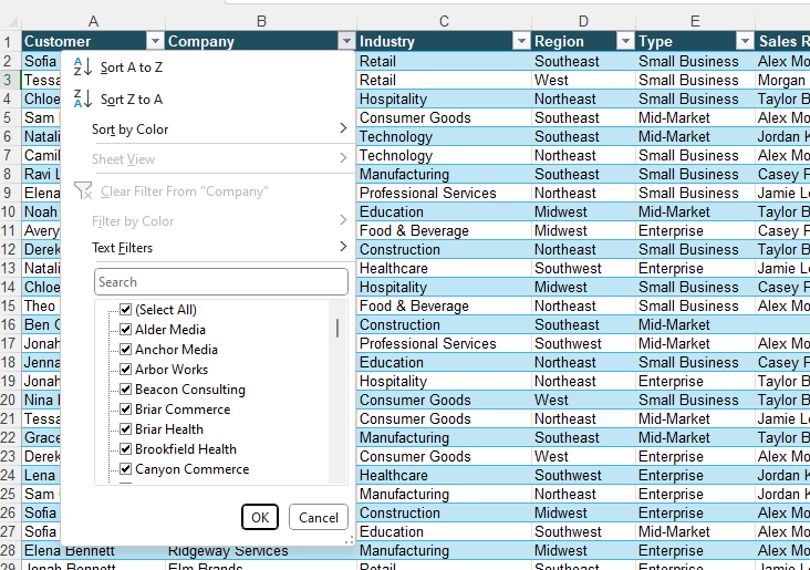
Translate the data question into an Excel task
Let’s ask a concrete question: Which Southwest customers have the highest YTD sales?
If you examine the dataset, you will see that there are columns for region and for sales totals. Let’s translate that question to what it means in Excel:
“Southwest customers” → Filter Region to “Southwest”
“Highest YTD sales” → Sort YTD Sales largest to smallest
Apply the filter and sort
To do this in Excel:
Click the filter arrow next to the Region column heading.
Uncheck Select All, check “Southwest,” and click OK. Your Table will now show only Southwest customers.
Next, click the filter arrow next to YTD Sales.
Choose Sort Largest to Smallest.
Now instead of the full 100 rows, you’re seeing just the Southwest customers, ranked by YTD sales.
Watch the video (YouTube)
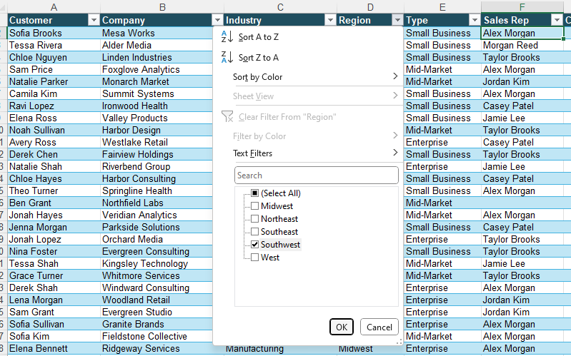
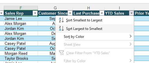
That’s it. You started with a business question and translated it into two basic Excel actions.
Now you can do the same with other questions. Which accounts are At Risk? Filter on Status. Recency of Purchase? Who purchased most recently? Sort by Last Purchase.
Skill 2: Conditional Formatting
Use it to: Spot what needs attention
Conditional formatting helps you spot what matters by turning the criteria you choose into visual cues - usually some pretty colors.
Some things you can do with conditional formatting:
Call out values above or below a threshold.
Surface blanks and duplicates.
Find dates that fall outside a range.
Let’s take our 100 rows that pretty much look alike, and see what pops out when we use conditional formatting.
For example, let’s say you want to know: Which customers have more than $75,000 in YTD sales?
Translate the data question into an Excel task
We want Excel to:
Look at YTD Sales → find values greater than $75,000 → highlight them.
That’s a conditional formatting rule: if a value meets a condition we choose, Excel changes how it looks so it’s easy to spot.
Instead of scanning 100 values yourself, you’ve told Excel what deserves your attention.
Apply conditional formatting
Watch the video (YouTube)
To create a rule to highlight YTD Sales greater than $75,000:
Highlight the column you are using as the basis for your rule - in this case, it’s YTD Sales. To do that, move your cursor to the top edge of the YTD Sales header until it becomes a downward-pointing black arrow, then click.
Click on the Conditional Formatting button from the Home toolbar.
Choose “Highlight Cells Rules.”
Select “Greater Than,” then enter $75,000.
Adjust how you want the highlight to look, and click OK.
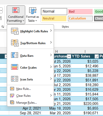
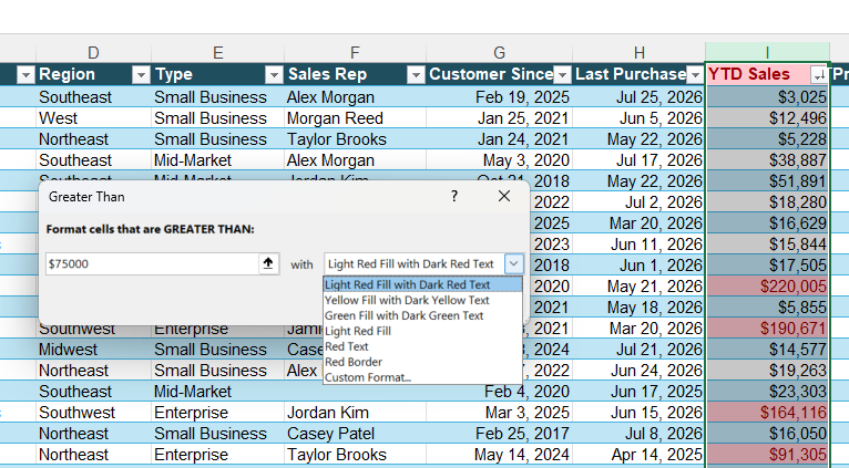
This is a very simple example - but conditional formatting is really powerful. You can color code your cells based on ranges of customer spend. If the number changes, or new rows are added, they will automatically inherit the rule.
You can also format cells based on less static instructions, such as highlighting the top 10% of customer spend YTD, or formatting only those values that are above the average. Formulas extend the capabilities of conditional formatting even further.
The important part isn’t the color. It’s that you decided what deserved attention and gave Excel a rule for finding it.
Your judgment determines what to look for; tool fluency makes it much more efficient to find.
Even these two basic skills have already changed the spreadsheet from a static document into something you can explore.
Want to do more with your data?
Filtering, sorting, and conditional formatting are a great place to start because you can use them immediately without writing a formula. Once you’re comfortable with those, a few more fundamental Excel skills let you start summarizing, comparing, visualizing, and connecting your data.
Here are five worth knowing, and the kinds of questions each one can help you answer.
Skill 3: SUMIF and COUNTIF
Use it to: Count or total something specific.
For example: Want to know how many At Risk customers you have, or how much YTD revenue comes from Enterprise customers?
SUMIF and COUNTIF let you calculate totals or counts only for records that meet criteria you specify. Start with SUMIF when you want to add values that meet a condition, and COUNTIF when you want to count them.
Explore it:
Click an empty cell next to your Table and type “=COUNTIF(“
Then move your mouse to the Status column header. When the pointer changes to a downward-pointing black arrow, click once. Excel will select the data in that Table column and insert the range into your formula for you.
Type a comma, then “At Risk”, and close the parenthesis.
That should produce something like:
=COUNTIF(Table1[Status],”At Risk”)
Now click another empty cell next to your Table
Type “=SUMIF(“
Select the “Type” data as the range by moving your mouse to the “Type” column header until the pointer changes to a downward-pointing black arrow.
Click once, type a comma, then enter “Enterprise” as the criteria. Type another comma and select “YTD Sales” as the values to add by clicking at the top of that column.
You should get a formula that looks like this: =SUMIF(E:E, “Enterprise”,I:I).
Skill 4: PivotTables
Use it to: Compare and summarize groups.
For example: How do YTD sales compare across regions?
Explore it:
Click anywhere in your Excel Table and choose Insert → PivotTable.
Accept the defaults and click OK.
From there, try putting Region in Rows and YTD Sales in Values. You can drag fields in and out to see how different groupings change the view.
Skill 5: Charts
Use it to: See or communicate a pattern.
For example: You’ve summarized YTD sales by region. Now, how can you make the differences easier to see and communicate?
Explore it: Start with the PivotTable you just created, showing Region in Rows and YTD Sales in Values.
Click anywhere inside the PivotTable, then choose Insert → PivotChart.
Choose a Column chart and click OK.
Excel will create a chart using the same regional sales totals you summarized in the PivotTable. Now you can see the comparison visually: which regions have the highest and lowest YTD sales, and how large the differences are.
Try changing the fields in your PivotTable. The chart will update along with it.
Want to explore further? Different charts help you answer different kinds of questions. For example, if your data included monthly sales over the course of a year, a line chart could help you see whether sales are rising or falling over time, and whether there are any unusual peaks or dips.
Skill 6: IF statements
Use it to: Apply a rule or classification.
For example: Suppose your company considers customers with more than $75,000 in YTD sales “Priority” accounts. How can you classify all 100 customers without reviewing them one by one?
An IF statement lets you turn a business rule like this into a field in your data: if YTD Sales are greater than $75,000, classify the account as Priority; otherwise, classify it as Standard.
Explore it:
Add a new column to your Excel Table.
Click in the first empty header cell immediately to the right of the Table and type in “Account Priority”.
Press Enter, and Excel will automatically expand the Table to include the new column.
Click the first data cell in your new column and type “=IF(“
Then click the “YTD Sales” value in the same row and type “>75000” followed by a comma
Type “Priority”, another comma, and “Standard”. Close the parenthesis and press Enter.
Your formula should look something like:
=IF([@[YTD Sales]]>75000,”Priority”,”Standard”)
Because you’re working in an Excel Table, Excel will automatically apply the formula to the rest of the column.
Want to explore further? IF statements can be useful anywhere you want Excel to apply the same decision rule consistently. For example, you could use the number of days since a customer’s last purchase to classify accounts for follow-up.
Skill 7: XLOOKUP
Use it to: Connect information from different places.
For example: Our customer data includes each customer’s Region. On the “Territory Map” tab, each Region is assigned to a broader Sales Territory. How can we add the correct Sales Territory to all 100 customer records without looking them up one by one?
XLOOKUP lets you bring information from one dataset into another using a field they have in common. Think of it like this:
What am I looking for? → Where should I look for it? → What should I bring back?
In this case, “Region” is the common field: Excel finds the customer’s Region in the Territory Map and returns the corresponding Sales Territory.
We’ve already formatted the small Territory Map as an Excel Table, just as we did with the customer data. That makes it easier to tell Excel exactly which fields to use in the lookup.
Explore it:
First, add a new column to your customer Table. Click in the first empty header cell immediately to the right of the Table, type “Sales Territory”, and press Enter. Excel will automatically expand the Table to include the new column.
Click the first data cell under Sales Territory and type “=XLOOKUP(“
Now tell Excel what to look for and where to find it:
Click the Region value in the same customer row. This tells Excel what to look for.
Type a comma, then click the Territory Map tab. Select the Region data in that Table by moving your cursor to the top of the Region header until you see the downward-pointing black arrow, then click.
Type another comma, then select the Sales Territory data the same way.
Close the parenthesis and press Enter.
Excel will find that customer’s Region in the Territory Map and return the corresponding Sales Territory. Because you’re working in an Excel Table, it will automatically apply the formula to the rest of the customer records.
Want to explore further? The same idea works whenever two datasets share a common field. You might use a product ID to bring product information into a sales file, or an employee ID to connect information from two HR reports.
A little tool know-how pays big dividends
Think about how much more you can now do with that same customer spreadsheet. You can filter to exactly the records you want to investigate. You can rank customers by something that matters, automatically highlight values that meet your criteria, calculate and compare groups, visualize patterns, apply rules to your data, and even connect information from another dataset.
You don’t need to memorize every Excel feature or know exactly how to do something before you start. Sometimes it’s enough to know that something can be done, what Excel calls it, and where to look when you need it.
And while there are increasingly sophisticated tools available for working with data, Excel remains one of the most useful tools we know for exploring and analyzing the small and medium-sized datasets that show up in everyday work. If you’re looking to make more use of data in your own work or operations, these fundamental skills are a very practical place to start.
Your judgment is still doing the important work. You decide what question to ask, what a measure means, which comparison makes sense, and what deserves your attention. Excel skills simply give you more ways to pursue those questions using the data in front of you.
Have a favorite quick Excel tutorial for one of these skills or a great Excel resource in general? Share it in the comments!


