

How We Build People’s Confidence With Data
Like gardening, getting your hands dirty with data matters. We've known this from experience, but we wanted to understand why. Here's what we learned.


There are moments in almost every career where you realize you’re a little out of your league. You’re expected to have an answer, but you’re not entirely sure what’s actually going on.
Maybe it’s your first role and you want to contribute something meaningful. Or you’re stepping into a new team or business and trying to get your bearings. Or you’re running your own operation and every decision feels high stakes.
Data should help in these moments, providing clarity and direction.
But for many people, it does the opposite. The dashboards look polished and the reports look definitive. Yet there’s a worry: What am I looking at? What does this number represent? What if I’m wrong?
So we rely on analysts. We lean on tools. We increasingly turn to AI.
All of these help, but they don’t solve the core problem. If you’ve only seen the final numbers - and not what they’re built from - it’s hard to feel confident acting on them.
What we’ve found is simple: confidence doesn’t come from better tools or delegating. It comes from spending a little time with the data itself looking at real rows, real customers, real events.
In other words, you have to touch the data.
This feels counterintuitive. With all the technology available, it seems like we should be able to skip this step. But you can’t outsource that familiarity. A polished dashboard or AI output can look convincing, but if you haven’t seen what it’s built on, it’s hard to fully trust or interpret it.
We wanted to understand why this step matters so much. So we looked at how people actually learn. It turns out there are three well-established principles that explain what’s happening.
Why touching the data works: three learning principles
1. People learn through concrete examples, not abstractions
Data is abstract. Summaries and dashboards make it even more so. But learning science shows that people understand concepts better when they start with concrete examples and then move to abstraction - not the other way around.

A marketing professor we know teaches a well-known behavioral economics concept about how people overvalue what they own. For years she explained it through a lecture. Students were skeptical — it just didn’t ring true. So she started running a simple experiment: she gives half the class a Kit Kat, asks them how much they’d sell it for, and asks the other half how much they’d pay. Almost every time, the Kit Kat owners demand more than buyers are willing to pay. The concept sticks because students experience it firsthand.
We are wired to learn this way. We remember what we can see, experience, and interact with.
Looking at the data itself works the same way. When you’re looking at actual customers, transactions, and events, you see the building blocks before it gets rolled up into a summary. Once you’ve seen that, the dashboards start making a lot more sense.
2. Better judgment starts with understanding what’s underneath
Research on expertise shows that people who understand how something is constructed make far better judgments than those who only see the final output. Experts organize knowledge around core concepts and relationships; novices rely on what’s visible on the surface. It’s like the physics student who memorizes formulas versus the one who understands the underlying forces. One will have context that sharpens his or her answer significantly.
The same applies to data. Dashboards summarize. AI spots patterns. Neither tells you about the data below it and that gap matters more than most people realize.
Take a simple example: “Average revenue per customer is $40.” That number could reflect two very different scenarios:
1,000 customers all paying between $35–$45 (stable, predictable)
1,000 customers ranging from $4–$75 (highly variable)
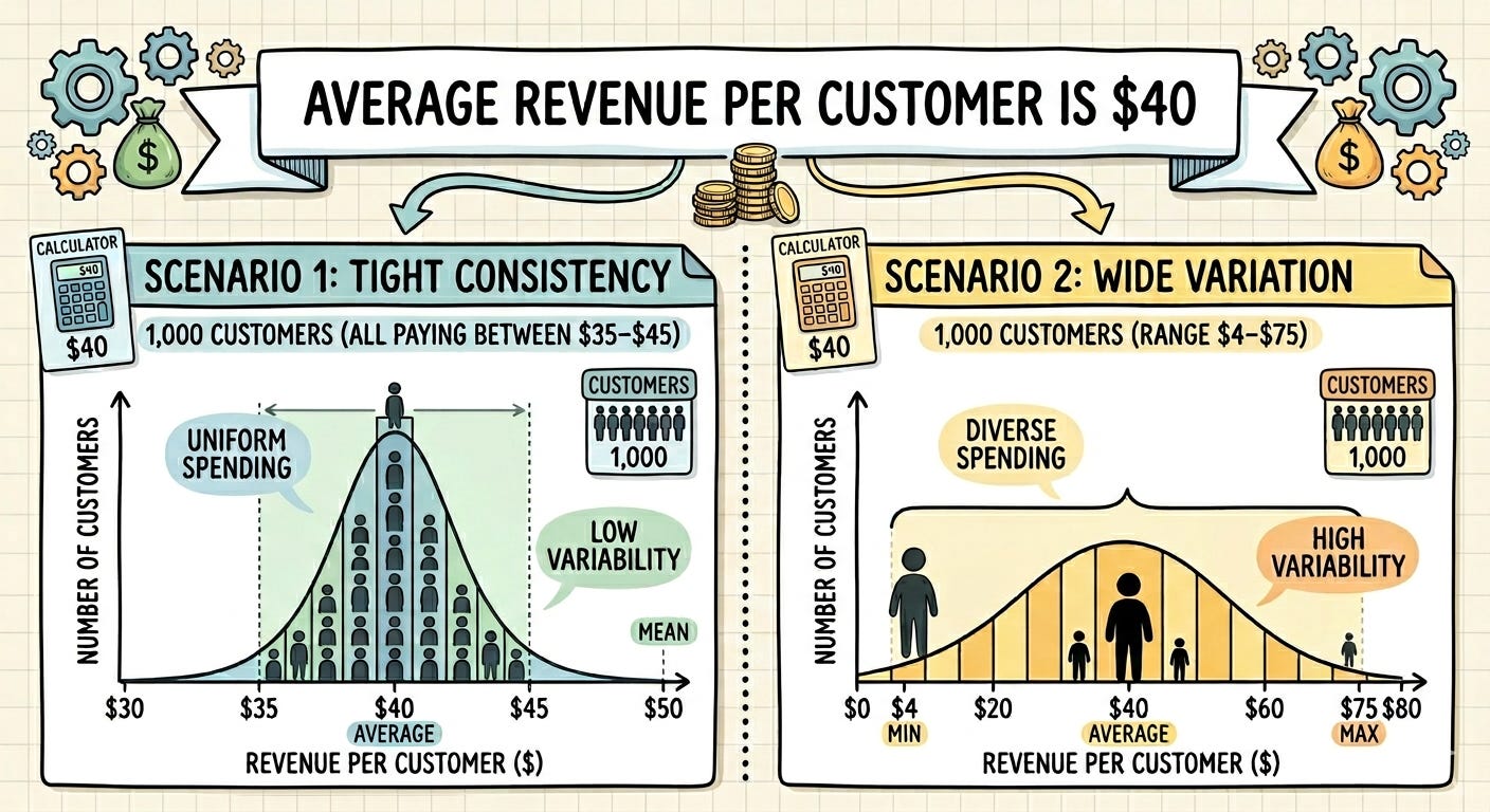
The dashboard shows the same number either way. Seeing the data itself gives a foundation to better understand what that information means and what it does not.
3. Learning and “transfer” (a.k.a. apply what you’ve learned elsewhere)
Research shows that people apply what they learn to new situations more effectively when they understand the underlying principles and structure, not just the outputs.
This means that when you’ve spent time with the data itself, you understand how it is organized, detailed, and start to recognize familiar patterns. You can then apply this when similar data shows up in different reports and contexts.
Instead of starting from scratch each time, you can get oriented faster because you recognize the building blocks. You have seen before how this kind of data works.
What about analysts and AI?
Analysts, dashboards, and AI tools are genuinely valuable. We use them. But they can’t replace your own grounding in the data.
Analysts bring expertise, but not your day-to-day context. They don’t know what feels off in the business right now. And their analysis is always shaped by their own experience and framing.
AI has a different limitation: it can produce excellent analysis, and it can also miss context or make incorrect assumptions. Sometimes it’s hard to tell which is happening.
If you’re not confident with the data yourself, you’re exposed to both of these limitations. You’re relying on someone else’s interpretation without a reliable way to evaluate it.
Even a small amount of time with the underlying data changes that. It gives you enough familiarity to work with analysts and AI tools more effectively, rather than simply deferring to them.
Why this matters
In a world full of dashboards, reports, and AI-generated answers, it’s easy to skip the step of actually looking at the data. Instead choose to actually understand the data. That small step in looking at real rows, real customers, real activity is what builds skill and confidence.
When you’ve seen the data, you build your understanding to judge when an analysis is overreaching, when something looks off, or when a result doesn’t quite line up with reality.
The three learning principles above explain something we’ve observed repeatedly: people who spend even a little time with the data develop a fundamentally different relationship with it. They are not intimidated or afraid. They are more confident and end up using the data well.
Getting started: building confidence with data
Here’s a practical sequence to work through with your team.
Choose one report tied to a real question you care about like revenue, leads, customers, usage, donations, support tickets.
Export the data. Look for “Export” or “Download.” A CSV file type is usually the easiest place to start.
Open it in Excel or Google Sheets. If it opens as a CSV, save a working copy as an Excel file.
Set a 15- or 30-minute timer and get curious. Keep a notepad nearby for observations and questions. The goal is familiarity, not a full analysis.
Start by scanning the columns. What does each field appear to represent? What looks complete or incomplete? Are there blanks, duplicates, or labels that seem inconsistent?
Sort one column at a time - by highest and lowest values, alphabetically, by date. This is the fastest way to spot ranges, outliers, and patterns that disappear in a summary.
Filter the data to ask simple questions. Look at one segment at a time: one month, one region, one product type. Move from “What is this report saying?” to “What is actually happening here?”
Do one basic summary. Add up a column, calculate an average, count rows in a category. Even simple calculations connect the row-level detail back to the bigger picture.
Build one pivot table. If you haven’t used one before, a quick YouTube tutorial will get you there in minutes. Put one category in the rows, one metric in the values, and see what shifts — product line by revenue, region by customers, month by support tickets.
Review your notes. What did you notice? What surprised you? What would you now ask an analyst, colleague, or AI tool?
Some references
Johnson-Laird, P. N. (1983). Mental models: Towards a cognitive science of language, inference, and consciousness. Harvard University Press.
Chi, M. T. H., Feltovich, P. J., & Glaser, R. (1981). Categorization and representation of physics problems by experts and novices. Cognitive Science, 5(2), 121–152.
Bransford, J. D., Brown, A. L., & Cocking, R. R. (Eds.). (2000). How people learn: Brain, mind, experience, and school (Expanded ed.). National Academies Press. https://doi.org/10.17226/59.


I agree with the premise, in fact, I’d push it further. Touching the data helps. It builds judgment. What it does not do is fix the upstream failures that make analytics and AI fragile in the first place: vocabulary debt, weak intake design, drifting definitions, and invisible decision logic buried in workflows. That is why so many teams can inspect the rows and still produce theater. Real confidence comes when row-level familiarity sits on top of operational grounding.