

What Is “Clean” Data, Really?
Clean data isn’t about perfection. It’s about shared understanding and being able to trust the results when you analyze it, make decisions, or use AI tools.


Most people think of data problems as typos, duplicates, and broken formats. You’ve probably run into it yourself: you open a dataset expecting to run an analysis, and quickly realize you can’t sort it, filter it, or trust the totals.
But not all issues show up that clearly. Ask five people in your organization what “active customer” means, and you’ll get five answers. Maybe six. And every one of them will be right based on the data they’re looking at.
Someone will say it’s anyone who made a purchase in the last two years. Someone else will say it’s anyone who logged in this month. Marketing will count qualified leads. Finance will only count currently paying subscribers. And the person who built the dashboard three years ago? They’re not quite sure anymore, because the logic changed and it was never documented.
Now you have two different problems: data that doesn’t work when you try to use it, and data that seems clear but means different things to different people.
Both show up all the time, and both can quietly derail your analysis. And as more teams rely on AI tools to summarize, transform, and act on data, these issues don’t go away - they get harder to spot and easier to scale.
So what makes data “clean”?
Clean data is data that is consistently understood and reliably usable when it matters.
It doesn’t have to be perfect or exhaustive. It does have to be trustworthy for the job at hand and interpreted the same way by the people using it.
Two things tend to go wrong:
Meaning problems: what does this actually represent?
Quality problems: is this usable and consistent?
Both matter. Most teams only focus on one.
The data problems you can actually see
These are the kinds of “messy” data you can spot right away - what most people think of when they hear “dirty data.” You open a customer list expecting to run a quick analysis. Instead, you get this:
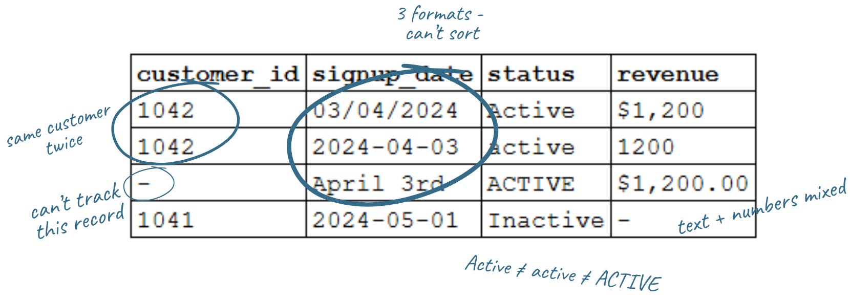
At a glance, it looks fine. But look closer:
Date formats don’t match
Status values don’t match
Revenue is stored inconsistently and is undefined
One record has no customer ID
One customer appears twice
Teams focus on this because it’s visible, and because it will actively break your analysis if you don’t fix it first.You can’t reliably:
Sort or group by date: 03/04/2024, 2024-04-03, and April 3rd won’t sort or compare without standardizing first.
Filter categories: Active, active, and ACTIVE look the same to you. They aren’t the same to a database.
Sum revenue: mix currency symbols with plain numbers and you’ll get errors or wrong totals.
Join to your customer database: a missing ID isn’t just blank. It’s a record you can’t link.
Trust your totals: Customer 1042 appears twice with different data. Which is right?
Even simple questions like “how many active customers do we have?” can give you the wrong answer because the data doesn’t line up.
This kind of mess is frustrating, but it’s also fixable. Most of it comes down to standardizing formats and making sure fields are structured consistently.
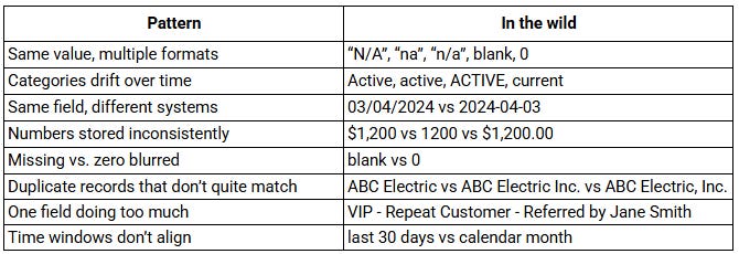
The usual suspects: messy data in the wild
Once you know what to look for, these patterns show up everywhere:.
Even if you clean all of this up - standardize formats, fix duplicates, fill in missing fields - you can still end up with the wrong answer if a more basic question hasn’t been answered: what does “active customer” actually mean?
When the same data means different things
This is easier to miss: the data looks clear, but people are using it differently.
We dug into this last week, but you’ve seen it:
Revenue → gross or net? recognized or booked?
New customer → signed up or paid?
Traffic → sessions, visitors, or page views?
Active user → depends who you ask
None of these are unreasonable. They’re just not defined consistently. So two people look at the same report, both are “right,” and still walk away with different answers.
Quick rule of thumb: if you don’t know the definition, you don’t know what you’re looking at.
Clean vs. messy: five questions to ask yourself
You don’t need to audit every field in every report to catch most data quality issues. But you do need to slow down and ask these questions before acting on the data.
1. Do you know what this field is measuring - and would your colleagues agree? If you had to explain this metric out loud, could you? If the answer is “sort of,” that’s your sign to pause and clarify before you go further.
2. Are there values that look the same but are formatted differently? Scan the unique values in a column. Variations in capitalization, spacing, abbreviations, or symbols can affect filtering and totals. If they should be the same, standardize them.
3. Does the total hold up if you check it a different way? If your report says you have 500 active customers, try counting a different way. Pull raw data, check another system, or ask someone else to run it. If the answers don’t match, take a closer look.
4. Do you know where the data came from and how fresh it is? “I got it from the dashboard” is not the full picture. What is the source? How often is it updated? Who owns it?
5. Are you clear who is included in a category or type? If you filter by “active customers,” could you explain exactly who qualifies? If not, the data isn’t ready to drive a decision.
Clean data in practice
Clean data isn’t about getting everything perfect. It comes down to two things: shared meaning and data you can actually use. Everyone understands the data in the same way, and when you use it, it supports the analysis or decision you’re trying to make.
Formatting and consistency issues make your data hard or impossible to analyze. You can’t sort it, filter it, join it, or trust the totals. Definition issues are quieter, but just as important. They lead to inconsistent assumptions, miscommunication across teams, and decisions that look right but aren’t grounded in the same reality.
The good news is that both are fixable.
On the technical side, establish standards (consistent date, currency, and number formats), clean up duplicates, and structure fields so data is entered reliably (dropdowns, required fields, validation rules). You can also ensure each field contains a single piece of information, choose a clear system of record, and standardize data before it’s used in reporting.
On the definition side, get clear on what key metrics actually mean and document those choices so they hold over time. In practice, that means defining metrics in plain language, pressure-testing them across teams, and making sure everyone is using the same definition when decisions are being made.
Your data doesn’t have to be perfect, and you don’t have to solve everything at once. But it does require a habit: taking the time to make sure you and your team agree on what you’re looking at - and that the data will support the analysis or decision you’re about to make. As AI becomes part of more workflows, these issues don’t just affect reports - they shape the outputs you rely on.
Related articles from We Dig Data:
Who Touched My Spreadsheet?

“Data governance” sounds heavy. It evokes corporate handbooks, compliance checklists, and expensive specialists. But at its core, it’s really about structure and habits: knowing what your data is, where it lives, who uses it, and how it's maintained.
AI at Work: Why Data Inputs Matter

Previously, we talked about problem framing, and how to clearly define your goals and success measures to set the stage for productive AI projects. With that foundation, the next step is to analyze your inputs: the information you give to AI shapes what you get back
Savvy Decision-Makers Question Data - Part 1

We use information every day to run our work - manage programs, allocate resources, pitch new ideas, and track progress. But how often do we pause and ask: Do I really understand the data in front of me? And is it the right data?
I just published a new book on the topic of data quality. Hope you don’t mind me announcing it here - https://www.andygrahambooks.com/books/data-behaving-badly/