

When Do You Trust Someone Else’s Data?
Every day you’re swimming in charts, claims, dashboards, and headlines. The challenge isn’t finding data, it’s deciding what to trust.


You are responsible for the data you use to make decisions. But there’s more data, more claims, and more “insights” than any reasonable person can thoroughly vet. A key skill today is deciding what deserves scrutiny and how much. But if you burn out fact-checking the data source for every stat that crosses your screen, you’ll end up trusting nothing - or worse, trusting everything because you’re too tired to care anymore.
So how do you evaluate a source in a world of information overload?
Ignore Unsourced Claims
If someone makes a data claim without citing where it came from, skip it. If the author didn’t take the time to source their data, then it’s not worth your mental energy to consider it as proof. Following this rule alone will filter about 80%* of what comes your way.
(*See what we did there? That 80% isn’t sourced because we made it up. The right move was to question it or ignore it!)
Evaluating Data, and an Example
With so much data, it is relatively easy to find a piece of data that supports a point you want to make. And someone making a claim using data is usually trying to convince you of something. That something may be true, but as with anyone trying to influence you or inform you, it’s worth asking:
Where did the data come from?
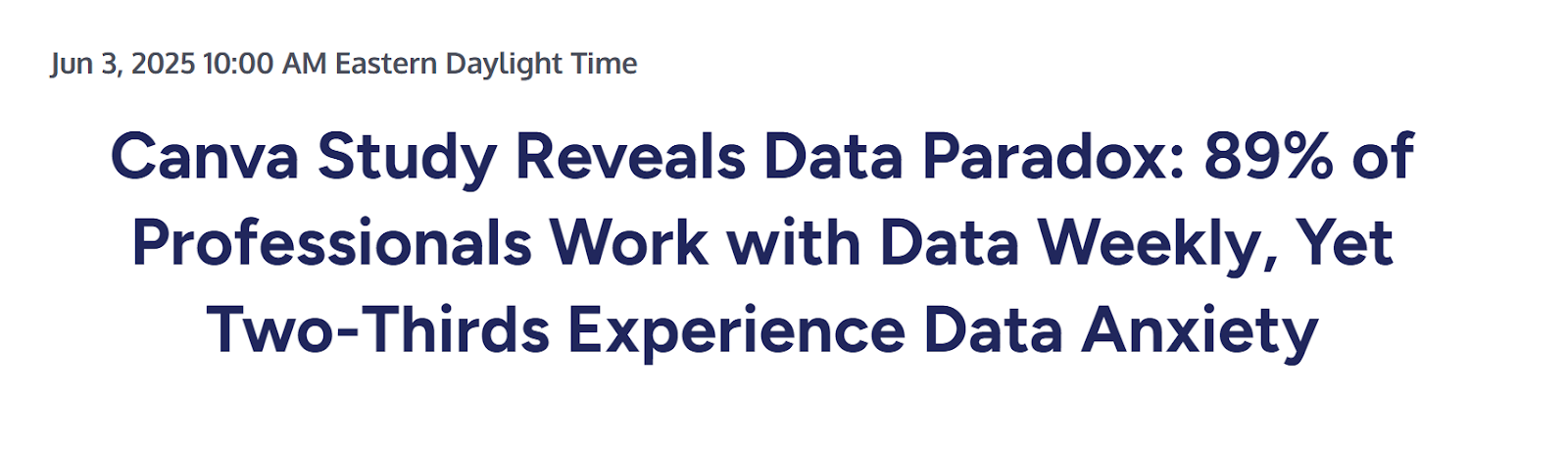
Let’s walk through a real example from 2025. This is a Canva press release citing data about data usage (yes, it’s meta, but it’s a good example).
Consider Who Published the Data
Data from established, credible sources - like census data or reputable research firms - is generally more reliable, especially when the organization specializes in data and has a verifiable track record.
Be more cautious with research from vendors, industry organizations, or think tanks. It may be solid information, but it usually aligns with their goals. It doesn’t mean the data is wrong, just that the data publisher has incentives that could bias how the results are framed or interpreted.
In our example, Canva - a company that makes online design tools - launched a 2025 product focused on packaging data visually. That gives them an incentive to highlight findings that make their product seem essential. We don’t automatically reject the data, but we do read it with that incentive in mind.
How Do They Get Their Data?
Context shapes how you interpret the data and how much trust you put into its accuracy and reliability.
Understanding who the data represents, how they were selected, and how much of that audience is actually captured is key. A small, well-defined sample can still be meaningful. A large, skewed one can be misleading. You need to ask whether the data appropriately represents the population behind the claim.
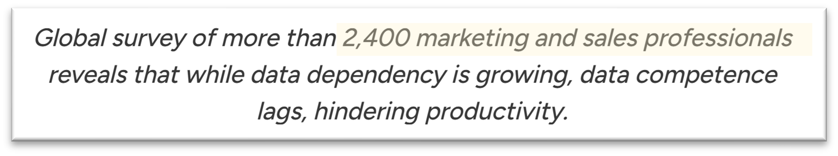
Who got surveyed? Too often, a data claim is attributed to a broader audience than it supports. In our example, Canva’s headline claimed “89% of professionals work with data weekly.” However, the Canva survey only targeted marketing and sales professionals and not operations, IT, finance, or product. That’s a significant gap.
Understanding who the data represents, how they were selected, and how much of that audience is actually captured is key.
Methodology Matters
All sources require a critical lens, including government agencies or official statistics. How a metric is defined, calculated and scoped determines whether it is actually relevant to your situation.
For example: Did you know that measures like GDP and inflation are calculated differently across countries? In the US, multiple official measures of inflation exist, and the most commonly cited one excludes food prices. If your industry depends on food costs, that number may not tell the story you need it to.
Transparency
Strong data sources explain how they collected their data and acknowledge limitations. If methodology is unclear or hard to find, that’s a signal to dig deeper. No data is perfect, but credible data can withstand scrutiny.
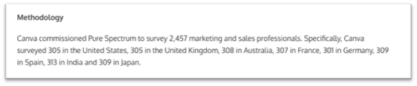
In our example, Canva shared methodology details and worked with an outside survey company to conduct the research. That level of transparency is meaningful even if there are still limitations to consider.
The Reality: Most Data Won’t Be This Transparent
The Canva example is somewhat unusual in that it clearly states who published the data, where it came from, and how it was collected.
More often, you’ll see something more like this from The Economist:
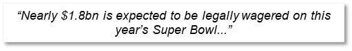
No source for the estimate. No footnote. No context. Just a number presented as fact. At that point you either accept it as face value or go hunting for the original source yourself. (We did. Here’s the link.)
“This Is a Lot of Work. Can’t I Just Use AI?”
Yes, with some caveats. Despite AI’s well-earned reputation for occasionally making things up, it can be surprisingly useful for the legwork of validating sources.
AI can usually help you:
Find and summarize the original source
Interrogate the methodology and limitations
Search for alternative data from credible sources that support (and contradict) what you are reading
Flag potential conflicts of interest based on available context.
For a structured approach to research using credible sources, this article from Joel Salinas offers a helpful framework and case study using Google’s NotebookLM.
AI should not replace your judgment on whether to trust a piece of data. It can however reduce friction and mental load of evaluating the data that crosses your screen.
More Reality: Everyone Has an Agenda
Everyone has goals, and those goals shape how data gets framed. A pharmaceutical company wants to show positive results to the FDA. A salesperson might tweak forecasts based on how they’re compensated. From students to policymakers, people interpret and feature data through their own lens.
Motivation doesn’t make data invalid, but it absolutely shapes presentation, emphasis, and interpretation. Factor in their agenda to interpret data responsibly.
Canva’s Study: What’s the Verdict?
Overall, the Canva study is directionally useful - with limits. We wouldn’t make high-stakes decisions based on it alone, but it’s reasonable to say that a large share of marketing and sales (not all) professionals are using data weekly and many of them feel anxious about it or would like more support.
We also keep in mind the context: Canva wants these findings to support their product launch, and the survey reflects marketing and sales professionals - not all professionals. Even within that group, results likely vary by industry.
One unexpected insight stood out more than the headline statistic:

That finding is less about Canva’s product than a universal risk; if nothing else, it’s a reminder to spot check a spreadsheet before acting on that data.
Why All of This Matters
Your decisions are only as strong as the data behind them. In a noisy world saturated with numbers and claims, your advantage is knowing how to discern what data deserves your confidence and how much.
That said, scrutiny has its limits. You can’t fully investigate every statistic you encounter. The goal isn’t perfect; it’s the discipline you can sustain.
Filter out unsourced claims. Prioritize transparent research. Leverage AI to help shoulder the investigative work. The result isn’t just better data consumption, but clearer conclusions and stronger decisions.


Great article!!